 We don’t need to blow our own trumpet, but, from time to time, we simply like to do it. This time, we have good grounds for a hearty self-pat on the shoulder.
Even bidorbuyers who always dislike change love the new design of bidorbuy. And what’s not to like. The new look is slick and easy on the eye.
It is also more than just a visual upgrade. Many new functions have been added, greatly enhancing the user experience. Especially for the buyers. Buyers can now navigate through the products on offer more easily and wrap up a purchase more efficiently.
Naturally, you will be able to perform some of the actions only after logging in. If you forget to do it before pressing the “add to the watch list” or “add to cart” button, a nice little box will pop up asking you to log in.
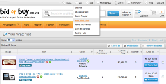
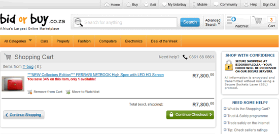
Once the items are in your watch list, you can go there, add the ones you want to purchase to the cart, and proceed to the checkout. On your way there you may, of course, flip some items out of the cart and add new ones.
As one bidorbuyer said on the bidorbuy.co.za page on Facebook, “now I’ll shop feeling like I’m at the mall”. Indeed, when you shop on bidorbuy you get your own personal shopping mall at your fingertips.
Snapshot of a watch list:
Snapshot of a shopping cart:


